Vertex Systems, a Dura Software company, had a well-known brand, but its marketing looked dated and inconsistent. I expanded that identity into a reusable visual system of layered hexagon patterns, custom illustrations, and updated photo treatments.
I applied the new system to the website, a promotional video, and a set of templates the marketing team used to create whitepapers, checklists, and infographics.
Visual system expansion, marketing and sales collateral, website redesign, motion graphics
Visual direction, graphic elements and photo treatments, marketing templates and collateral, motion graphics, website design, UX and content structure, and Salesforce form integration
B2B SaaS (IDD and rehabilitation software)
2024
Adobe After Effects, Premiere Pro, Illustrator, and InDesign; Synthesia (AI voice-over)
Vertex had a strong reputation and an established customer base, but its website looked dated, its visuals were inconsistent, and visitors struggled to quickly understand what the software did. The goal was to modernize without rebranding: keep the core identity and build graphic elements flexible enough to use in every marketing channel.
I worked directly with Dura’s marketing director and content writer throughout the project, from the visual system to the website, collateral, and video. I also partnered with the sales team on the website, connecting its forms to Salesforce so each inquiry was tagged with the correct campaign and lead source and routed to the right sales team.
Instead of replacing the brand, I extended it with layered geometric elements, custom illustrations, and updated photography treatments that gave the website and marketing materials a more modern visual direction while keeping them recognizable as Vertex.
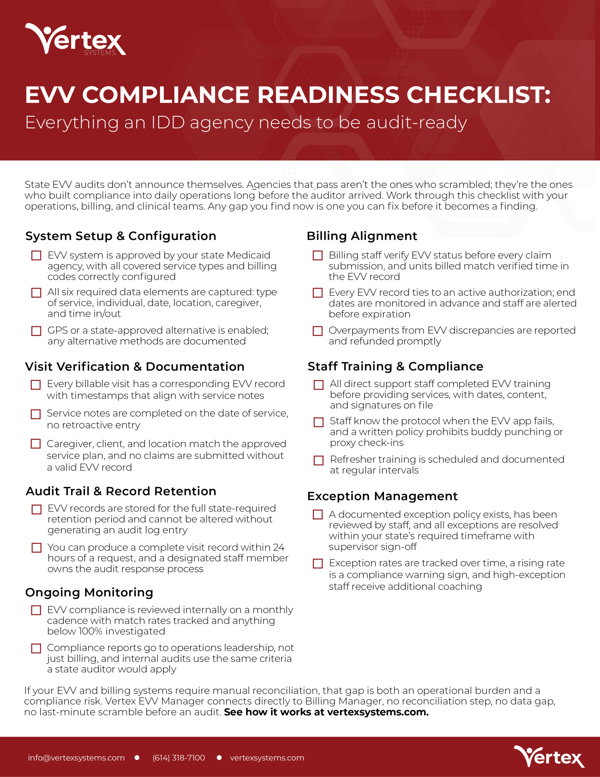
Both examples were created by other members of the Dura marketing team. The after example was built from templates I designed, and I refined its typography and spacing.
Before Modernization
After Modernization
01
A clear main title and subheadings lead the eye, while body text stays one consistent size and weight.
02
Soft hexagon shapes keep the design consistent with the brand without overpowering the text.
03
Bold text makes the action item stand out, so readers know exactly what to do after reading.
04
A solid red footer bar separates the contact details and logo, which previously blended into the body text.
As other Dura marketing team members built new materials with the refreshed brand, I reviewed their work and refined it where the layout or typography needed adjusting.
On this checklist, I:
The refreshed visual style became the foundation for Vertex’s sales and marketing materials. I designed the overview brochure and created templates based on the new design system. The Dura marketing team used the templates and visual style to produce whitepapers, checklists, infographics, and other sales materials, giving Vertex a consistent, professional look across its collateral.
The whitepaper and infographic were produced by the Dura marketing team using my templates and visual system.
The module icons on the brochure are the official Vertex product icons.
I reorganized the content, strengthened the visual hierarchy, and redesigned page layouts so Vertex’s solutions were easier to understand and navigate. The site carried the expanded visual system through hexagon framing, custom illustrations, and consistent photography treatments, creating a cohesive experience across digital and print.
To support digital marketing efforts, I created a promotional video that extended Vertex Systems’ refreshed visual identity beyond static design. Using Adobe After Effects, I developed motion graphics and animated visual elements that complemented the redesigned website and supporting marketing materials.
I brought everything together in Adobe Premiere Pro, editing the video to create a cohesive narrative with smooth transitions and engaging pacing. I also used Synthesia to generate the voice-over, integrating the narration with the visuals to help communicate Vertex’s solutions clearly and effectively.
The finished video gave Vertex an additional way to showcase its solutions across digital marketing channels while reinforcing a consistent visual identity.
The expanded visual system gave Vertex a more modern, consistent presence across print and digital, while providing the marketing team with reusable templates and design elements they could apply across future projects. The graphic elements and promotional video continued to appear in Vertex’s marketing, demonstrating the flexibility and longevity of the creative work.
This work was part of a broader marketing strategy across Dura Software’s portfolio that contributed to a $1M year-over-year increase in qualified leads.
I’m looking for my next opportunity to create polished, on-brand work in print, digital, motion, and web with a team that values great design.
Brand and Graphic Designer
© 2026 Amanda Gomez. All rights reserved.